1.3 Data Visualization Filters
Affinio offers multiple data filtering perspectives, so you can interpret the information in a way that resonates with you. Simply choose your desired perspective from the drop-down menu to the right of the data you are analyzing.
1. Normalized: the colored bars represent that term’s usage in each of the other clusters; this allows you to see whether a term is widely popular or simply over-indexes for a particular cluster.

2. Bar Chart: this graph shows how many times a term was used over 30 days for easy comparison of data point prevalence.

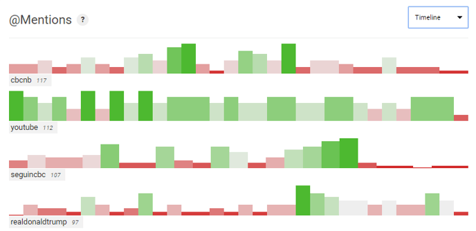
3. Timeline: a graph that represents the daily frequency for a given term over 30 days; this filter is available exclusively within the content section. Dark green marks the max value in this timeline, whereas red marks the minimum.

4. Word Cloud: this filter offers a more intuitive approach for data interpretation where the size of the word reflects its usage popularity. When viewing at the cluster level, the Word Cloud visual can be toggled to Volume (Normalized default), or Niche Rank (as most differentiated from other clusters).


The Filter metric saturation (module level) slider allows you to see how the top results change when you require more minimum member coverage. This slider applies to audience penetration when viewing metrics at the overall audience level, or cluster penetration when viewing metrics at the cluster level.

