
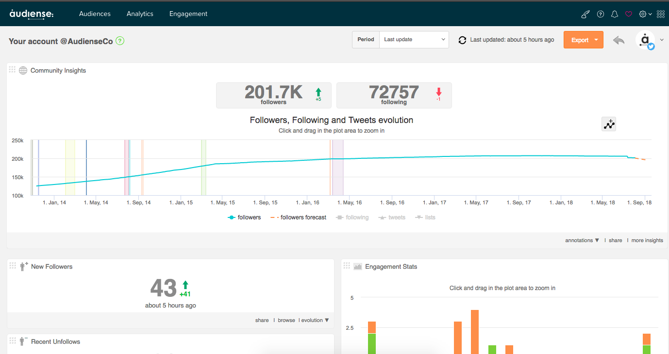
The dashboard, together with the community wall, is one of the principal screens of Audiense Connect. It provides detailed information about a community in the form of panels and interactive widgets which are updated every 24 hours so you can track interactions and the evolution of the community on a daily basis.
Note that this post describes the dashboard for an owned account. If you select a source then the source dashboard may use some other widgets and panels.
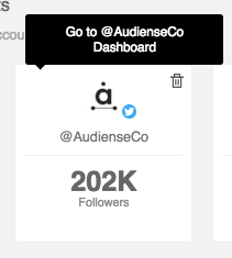
To access the dashboard click the top half of the relevant account or source panel on the homepage.
Synchronisation
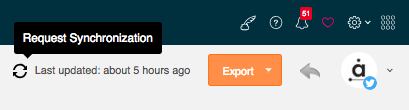
By default the data shown is based on the latest synchronisation of your Twitter account with Audiense. See here how to manually synchronise your account and change the time span of your widgets.
Export
Click Export in the top right corner and select PDF to export the widgets to a PDF file.
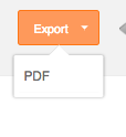
Note: The export feature is only available for users with a Twitter Marketing plan or an Audience Insights plan. Users with a Free plan will not be able to complete this action.
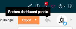
Restore removed panels
Click the arrow next to export to restore any panels/widgets, which you previously removed, to the bottom of the dashboard or to their original default setting.
If you select a source then the dashboard also shows some source comparison widgets which compare the selected source with the Twitter account you are logged in with.
You can create your own custom widget to easily monitor specific members of a community.
Dashboard widgets
Actions common to all widgets:
Click the nine dot grid in the top left corner to drag and drop the widget and rearrange widget positions.
Mouseover the ? icon to see an onscreen help description.
Mouseover the widget and click the x icon to remove it from the dashboard.
The two principal widgets are:
- Community insights – See the evolution of the community over time.
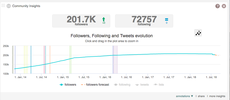
Mouseover over any part of the chart to get accurate information by date.
Click and drag a box in the chart to see the growth over a more specific time period. You can accurately select the dates with the emerging date window. Click reset zoom to return to the original chart.
Click any combination of the followers, followers forecast (an estimate of future growth), following, Tweets and lists icons below the chart to see those metrics on the chart.
Click the followers or following buttons to browse these users on the community wall.
Click the annotations drop-down menu to manage (add or edit) annotations. These are the coloured areas in the chart which represent specific campaign periods or any events you want to highlight.
Click more insights to see the default Community Insights report for that community.
- Engagement stats – See the evolution of engagement over the previous 24 hour period.
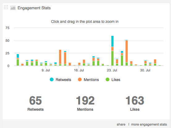
Mouseover over any part of the chart to get accurate information by hour.
Click and drag a box in the chart to see the growth over a more specific time period. You can accurately select the dates with the emerging date window. Click reset zoom to return to the original chart.
Click any combination of the Retweets, mentions and likes icons below the chart to see those metrics on the chart.
See the total number of Retweets, mentions and likes below the chart.
Click more engagement stats to see Tweet Analytics in detail.
Community widget actions:
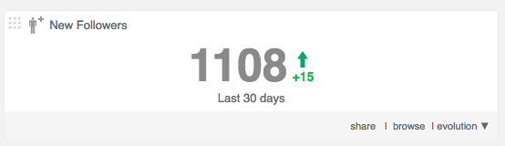
Click browse or the central number to see these specific users on the community wall where you can search and filterusers and perform the community management actions given in the tips below.
The small green or red number is the change compared with the previous synchronisation. Green for an increase, red for a decrease and a blue = sign for no change.
Click evolution to expand the widget and see the change over time.
The Community widgets are:
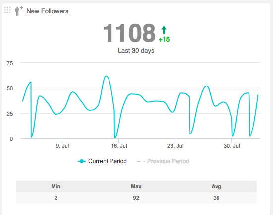
- New followers – New followers since the last synchronisation.
- Tip: Find users to follow back, tag, send a welcome message, etc.
- Recent unfollows – Users that were following you before the last sync but now don’t.
- Tip: See if there is any pattern to these unfollows, perhaps a DM Campaign gone wrong, you are just too ‘noisy’, etc.
- Tip: Find users you might unfollow in return to clean up your community and improve your follow ratio. *
- My influencers – Users who influence me, i.e. people I have mentioned, Retweeted or liked.
- Tip: Keep track of your latest interactions and add a tag or a note to help manage these important users.
- I influence – Users who I influence, i.e. people who have mentioned, Retweeted or liked me.
- Tip: Keep track of your latest interactions and add a tag or a note to help manage these important users.
- Not following you back – Users you follow that don’t follow you back.
- Tip: Find users you might unfollow to clean up your community and improve your follow ratio. *
- Tip: Find influential users and interact with those you want to gain as followers in the future.
- You aren’t following back – Users who follow you but who you don’t follow.
- Tip: Find users you should be following, e.g. influential users, users in a similar market sector.
- “Low Follow Ratio” users you follow – Users you follow who are not influential and have a follow ratio of 0.2 or less. *
- Tip: Find those you might unfollow to clean up your community and improve your follow ratio. *
- Inactive people you follow – Users you follow but who haven’t Tweeted in the previous three months.
- Tip: These users are candidates to unfollow to clean up your community and improve your follow ratio. *
- Famous people you follow – Users you follow who have verified accounts.
- Tip: Engage with these users to gain them as followers. High profile users can give your Tweets a lot of exposure if they Retweet you in the future.
- Influential people you follow – Users you follow who have a follow ratio of 2 or more. *
- Tip: Engage with these users to convert them into your followers.
- Tip: They are influential for a reason so monitor them to gain ideas about how to improve your own content.
- Recently followed – Users you have followed since the last sync.
- Tip: Organize new contacts with lists, tags and notes, etc.
- Newbie people you are following – users you follow who joined Twitter less than three months ago. Sorted by account age.
- Tip: Monitor these users to see which are worth engaging with more directly.
- Very active people you are following – Users you follow who send more than 50 Tweets per day. Sorted by Tweets per day.
- Tip: Engage with these users to gain them as followers.
- “Low follow ratio” followers – Non-influential users who follow you but who have a follow ratio of 0.2 or less. *
- Tip: Low-value users may not be worth targeting.
- Inactive followers – Users that follow you but who haven’t Tweeted in the previous three months.
- Tip: Users who probably don’t see the content you post. This gives you an idea of your potential reach.
- Famous followers – Users that follow you and have verified accounts.
- Tip: Target these users as they are influential and can greatly expand your reach.
- Influential followers – Users that follow you who have a follow ratio of 2 or more. *
- Tip: Engage with these users as they can Retweet your Tweets.
- Tip: They are influential for a reason so monitor them to gain ideas about how to improve your own content.
- Newbie followers – Users that follow you who joined Twitter less than three months ago. Sorted by account age.
- Tip: New users have fewer contacts to engage with so initially may Retweet your Tweets more frequently.
- Tip: Ensure these users are not spammers or fake profiles before following back.
* Follow ratio – This is a numeric value which indicates the degree of influence or popularity of a user. The higher the ratio the more influential the user is and the more value they are to you. It is calculated by comparing the number of followers a user has with the number of people they are following, for example:
- 1000 followers / 500 following = high ratio of 2 which means this user is influential and of high value.
- 1000 followers / 5000 following = low ratio of 0.2 which means this user is not influential and of low value.
Tip: You should try to improve your own follow ratio to increase your influence by periodically cleaning up your community. You can do this by reducing the number of people you follow, e.g. unfollow inactive users and those of low value to you, or you can increase the number of people who follow you which is more difficult to achieve and requires work at creating engaging content to attract those users you can benefit from.
Other widgets are:
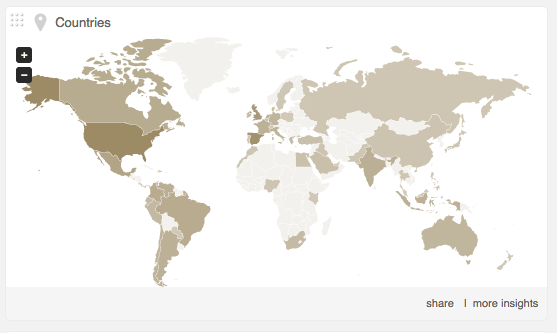
- Countries – a map showing the users according to country.
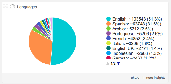
- Languages – A pie chart showing the primary languages of the community.
- Gender – A pie chart showing the distribution of the community by gender.
Click more insights to see the default Community Insights report for that community.
Click in the map or pie charts to see these specific users on the community wall.
- Following Bio Tag Cloud – Generated from the bios of the users you are following.
- Followers Bio Tag Cloud – Generated from the bios of the users who follow you.
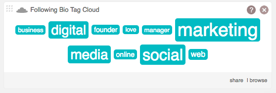
Click individual tags to see all the users who used that word in their bio on the community wall.
Click browse to see the complete tag cloud.
Notes
If you have just added the account to Audiense Connect it isn’t possible to see any history about this account, as we can only retrieve data from the time of registration.
Discrepancy between info on the dashboard and info in Tweet Analytics.
The dashboard reflects any ‘events’ which have occurred in the time period selected. For example, in this time period you may have received a like of a Tweet which you posted two years ago. Tweet Analytics, on the other hand, is based only on the Tweets of the selected period and the ‘events’ that these specific Tweets generate. For this reason you may notice fewer likes, Retweets, replies, etc., in Tweet Analytics than you see on the dashboard.