Account Comparison
The Account Comparison tool allows you to compare two or three accounts. For example, compare your account with your two main competitors to gain insights you can use to modify your marketing strategy.
Note: Users with a Free plan do not have access to this function. Users with a Twitter Marketing plan or an Audience Insights plan will have access.
Limitations: The accounts to be compared must be owned accounts or third-party accounts you have added as a source.
1. Select Account Comparison from the analytics drop-down menu on the top menu bar.
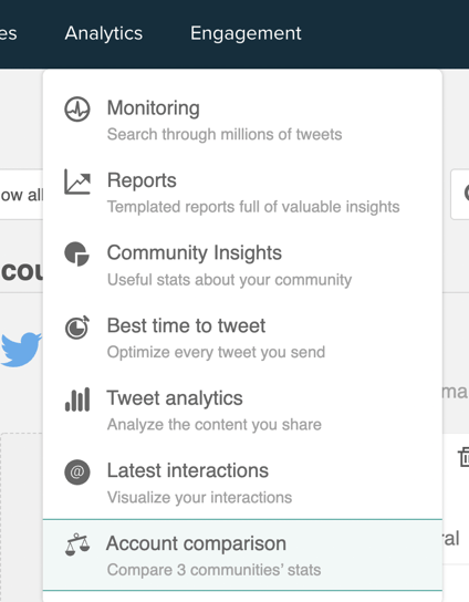
2. The Account Comparison listing opens.

Each account comparison report you have previously generated is shown in list format. You can see the date the report was generated and the accounts which were compared. To eliminate a report click the remove bin icon on the right.
Create an Account Comparison report
1. Click the new comparison button in the top right of the listing to open the accounts selector panel.
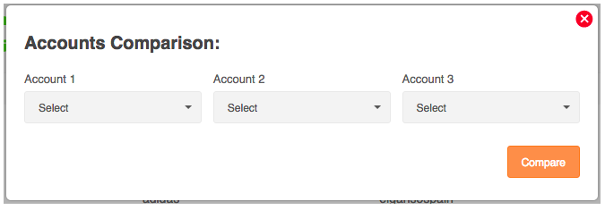
2. From the drop-down menus select two or three accounts and click compare to generate the report. The report may take a short time to generate but you can continue to use Audiense while you wait.
View an Account Comparison report
Click the date of any report of the listing to see the dashboard associated with that report.
Account Comparison report dashboard
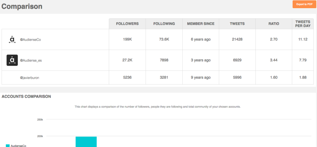
Click export to PDF to download the report to your computer. Compare various reports taken over time to see any changes and modify your marketing strategy accordingly.
There are two summary panels:
- Accounts summary panel

- – Followers – The number of followers.
- – Following – The number of people the account is following.
- – Member since – The number of years of Twitter activity.
- – Tweets – The total number of Tweets sent.
- – Ratio – The number ratio of followers to following; a good measure of influence.
- – Tweets per day – The average number of Tweets sent per day.
- Accounts comparison panel
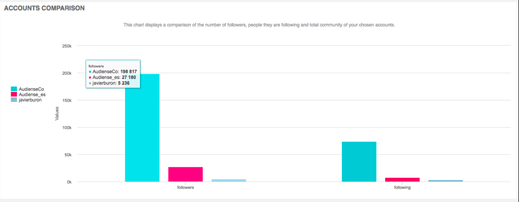
A bar chart which shows the number of followers and following of the accounts in graphical format. Mouseover each chart to see the exact numbers.
Select the followers or following tab to see data specific to those users:
Panels on each tab can take the format of:
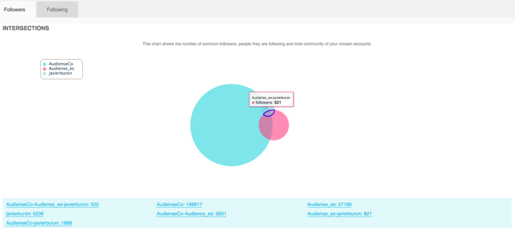
- [1] Venn (Set) diagrams, e.g.
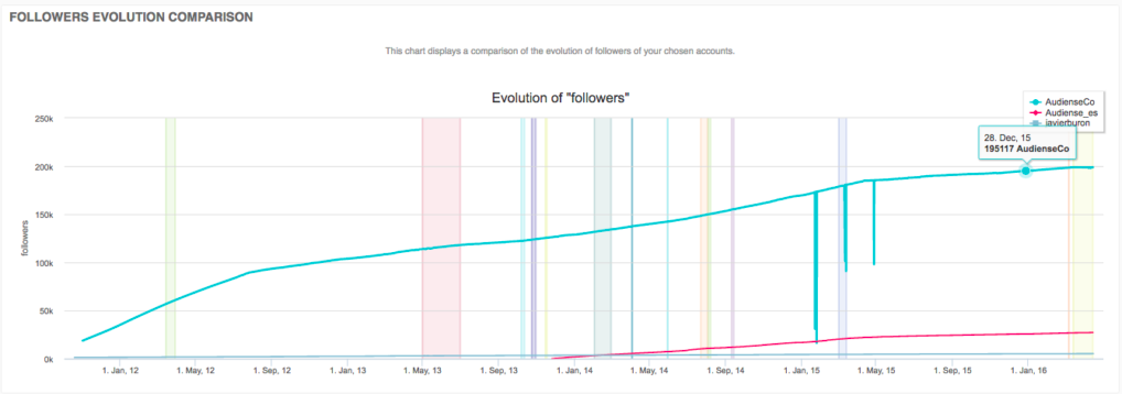
- [2] Line graphs, e.g.
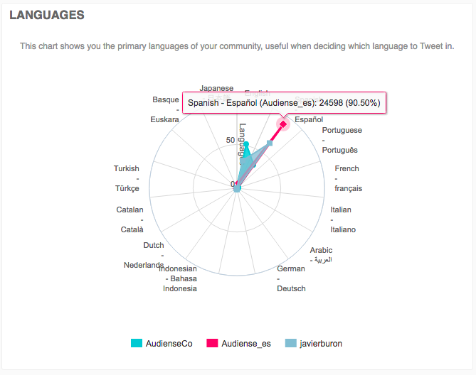
- [3] Radar (spider) charts, e.g.
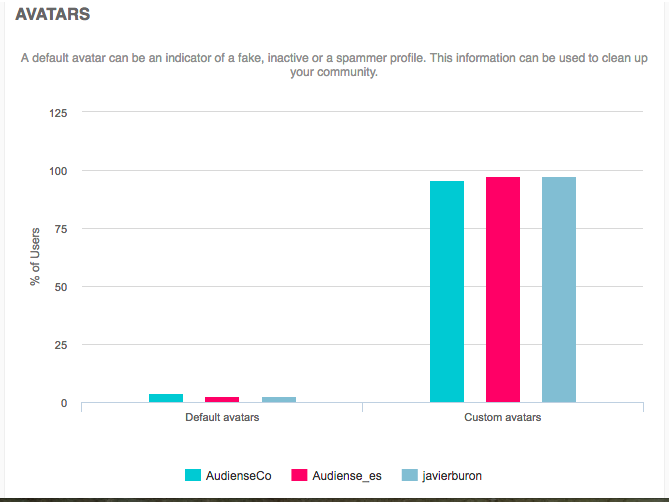
- [4] Bar charts, e.g.
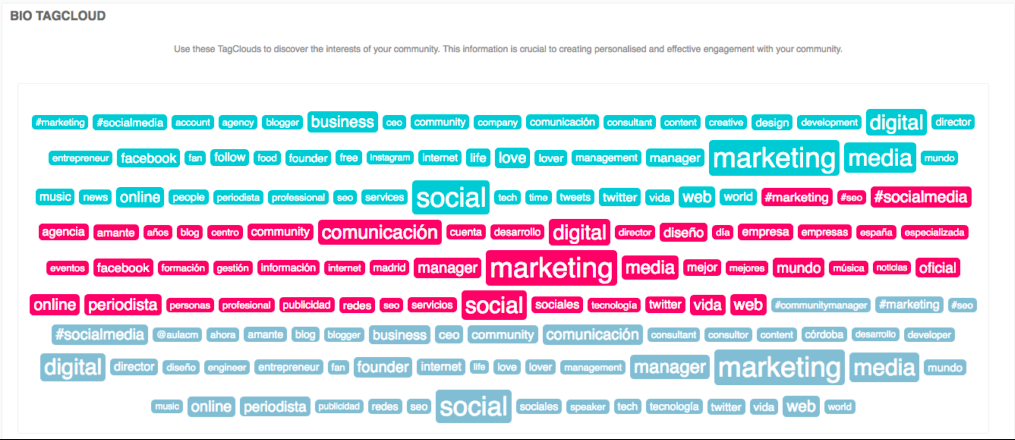
- [5] Tag clouds, e.g.
The panels available on the report, with the format in square brackets, are:
- [1] Intersections – The intersections between the accounts, i.e. how many users the different accounts have in common. At the bottom of the panel you can see all the intersections between the accounts with the number of users of each intersection.
- [2] Followers evolution comparison – A comparison of the rate at which the accounts are growing with respect to followers.
- [3] Languages – The languages spoken by the community of each account.
- [3] Locations – The locations of the accounts. May be useful for locating new markets to target.
- [4] Avatars
- Custom – Usually indicates a genuine user.
- Default – May indicate fake, inactive or a spammer profiles.
- [4] URLs – Does the user have a link in their bio?
- URL – Usually indicates a professional and links to a company, blog, LinkedIn profile, etc.
- No URL – May indicate users of less interest to you.
- [4] Privacy –
- Public – Ideally the more the better as they have the potential to expand your reach.
- Private – Unlikely to be a professional.
- [4] Verified
- Non-verified
- Verified – Usually people of high influence, e.g. business leaders, politicians, journalists, musicians. They can massively expand your reach by Retweeting your posts.
- [4] Followers – Users grouped by the number of followers they have. Indicates your potential reach. The more followers your followers have, the more people will see your Tweets if they Retweet you.
- [4] Number of people they are following – Users grouped by the number of people they are following. Users who follow many people are unlikely to read all your Tweets unless you are included in a list.
- [4] Ratio – Users grouped by their ratio of followers/following. Indicates how influential the community is. Users want to listen to what high ratio users have to say.
- [4] Time since last Tweet – Users grouped by their activity level. Indicates how active the community is. Can influence who you unfollow. Active users are more likely to see and Retweet a Tweet. Users who have not Tweeted in a long time may no longer be using their Twitter accounts and are probably not worth following.
- [4] Tweets per day – Users grouped by the Tweets per day. Active users are more likely to Retweet, reply, etc. However, overly active users may be spammers or create too much noise and may influence your unfollows.
- [5] Bio – Indicates the interests of the community. Based on bio information. Useful for finding ways to engage with users you wish to target and for checking you are targeting the right people.
All the panels except bio have an interactive key which you can use to toggle visibility of the individual accounts and add/remove them temporarily from the chart.
Mouseover different points or areas of the panels to see exact figures relating to that area. The panels are interactiveso click the area of interest to browse the users on the community wall and and carry out community management actions.