View a BTTT report to see the optimum time to Tweet to reach the maximum number of users in a community.
View a BTTT report
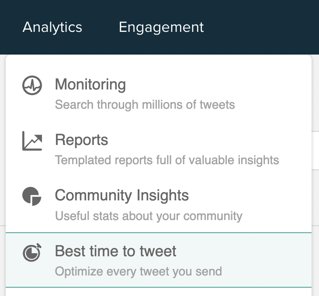
1. Select Best Time to Tweet from the analytics drop-down menu on the top menu bar.
2. The BTTT reports screen opens. Each report you have previously generated is represented by a panel.
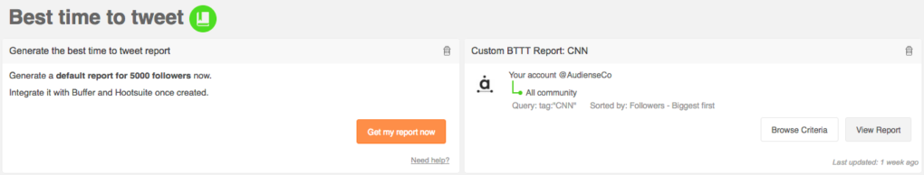
There are two types of report:
- Default BTTT report
- Custom BTTT report (for an individual or audience)
The default BTTT report for your community is in the top left of the screen. Click get my report now to see the dashboard associated with the default report.
There is a panel for each custom BTTT report you created for a specific audience. Each panel shows the criteria used in the query and when the report was last updated. Click browse criteria* to see the audience on the community wallthat the report is based on. Click view report to see the dashboard associated with that report.
Click the remove bin icon in the top right corner to eliminate any report which you no longer require. You can export a default or custom report to PDF.
* The browse criteria button is not available with default and individual custom reports.
The default and custom BTTT report dashboard
1 – Report summary panel
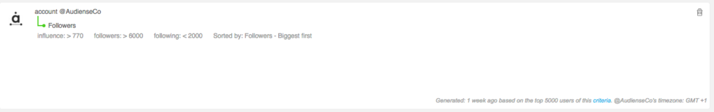
This panel shows:
- the search/filter criteria the report is based on.
- when it was generated, e.g. 1 week ago, 21 minutes ago, 1 day ago.
- click criteria to browse the audience on the community wall.
- the time zone you selected when creating the report.
2 – Summary of key BTTT data

Click share to open the Tweet Editor and send a Tweet with this information.
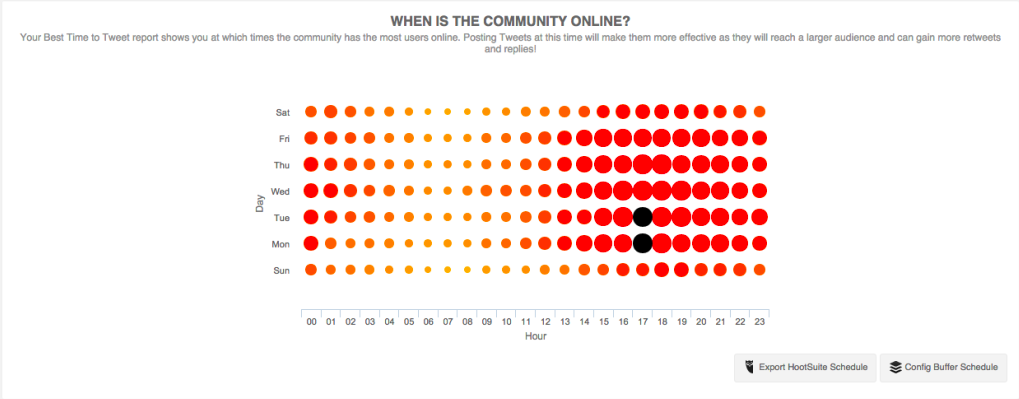
3 – Panels that can take the format of:
- [1] Heat maps, e.g.
- [2] Area graphs, e.g.
- [3] Tag clouds, e.g.
The panels available on the BTTT report, with the format in square brackets, are:
- [1] When is the community online? – The principal BTTT panel is an estimation of when the most community users are online. The larger and redder a circle is the more users are online at that moment. The black circle(s) represent your best time to Tweet in the next 24 hours and your best time to Tweet of the week. Tweet at these times to make your Tweets more effective as they will reach a larger audience and are more likely to gain Retweets and replies.
- Click the export Hootsuite schedule button to schedule your Tweets using Hootsuite.
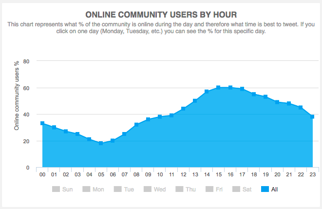
- [2] Online community users by hour – The percentage of the community which are online over a 24 hour period. Click the individual days at the bottom to see the percentage for that day.
- [2] Online community users by day of week – The percentage of the community which are online over a seven day period.
- [2] Potential exposure by hour – The sum of the community followers that potentially can read your Tweets over a 24 hour period. There may be more users online at one particular time but the reach is higher at another because those users are more influential. Click the individual days at the bottom to see the potential number of users for that day.
- [2] Potential exposure by day of week – The sum of the community followers that potentially can read your Tweets over a seven day period. There may be more users online on one particular day but the reach is higher on another because those users are more influential.
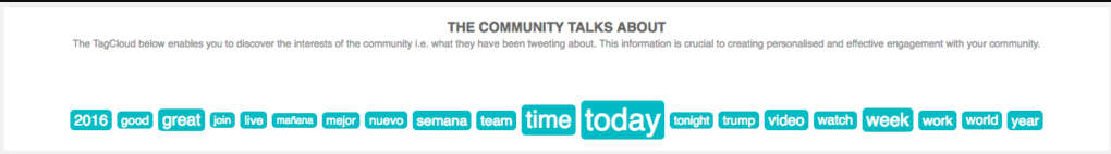
- [3] The community talks about – Discover the interests of the community, i.e. what they have been Tweeting about. Use this info to help engage more effectively with the users.
- [3] Your followers top hashtags – Discover the interests of the community, i.e. the most common hashtags. Use this info to help engage more effectively with the users.
- [3] The community shares links about – Discover the interests of the community, i.e. what the community has been sharing links about. Use this info to help engage more effectively with the users.