In this guide, we will walk you through the Audience Breakdown view, a powerful feature that helps you gain a deeper understanding of the segments within your audience. By breaking down your audience into distinct clusters, you can uncover meaningful insights that inform your strategy and decision-making. This article covers key aspects of audience segmentation, including how clusters are defined, how to interpret the visual data, and how to make the most of the tools for analyzing and managing clusters.
Whether you're renaming clusters, merging them, or exporting your data, this guide will provide clear steps and best practices for working with your audience's segmentation. Use the index below to easily navigate through each section of the article.
Index
In the Summary View of your report, click on "See All Clusters" to navigate to the Audience Breakdown View.

Audience breakdown view:

On the right-hand side, you'll find a summary representing the full audience, while the left-hand side displays the Clusters Distribution Graph, which visualizes the segments that make up the audience.
Understanding your audience as a whole is important, but no audience is a monolith. Equally crucial is identifying the distinct sub-communities, or clusters, within your audience. These clusters highlight groups with shared interests and characteristics.
To learn more about our clusters and segmentation methods, read more here.
Cluster Visualization Features
- View All Clusters: Visualize all clusters in the graph, not just the top 10.
- Reposition Labels: Drag and drop cluster labels to adjust their position for better clarity.
- Toggle Cluster Labels: Use the new toggle to hide or show cluster labels as needed.

- Export network graph image: Download from the Actions menu or just by clicking on the Download icon below the graph.
- The image can be downloaded with or without the cluster labels (names) depending on what you have selected at the time of the download.
- Image format is png, with transparent background to make it very easy to add to any presentation.


Audience Sampling in Insights
When defining an audience in Audiense Insights, the sample size is capped at 250K members. This sample size is sufficient to:
- Understand your audience and the clusters that comprise it.
- Expand insights for additional use cases, such as finding lookalikes or running advertising campaigns.
- Cluster Size: The size of each cluster in the graph is proportional to the number of members it contains. Larger clusters indicate a higher number of members.
- Edges (Links/Lines): These represent the connections between nodes. For example, in the Interconnections graph, the edges show follows exclusively among audience members.
- Interconnections Graph: Here, all nodes represent audience members, and all connections (edges) are exclusively between them. This graph visualizes how members of the audience are connected to one another.

- Affinities Graph: In this graph, nodes represent both audience members and influencers. Edges indicate connections not only between audience members but also between audience members and influencers.

- Node Size: The size of each node corresponds to the number of connections it has. Larger nodes have more connections. Hovering over a cluster in the interface highlights the connections for that cluster.
Cluster Summary Cards
This section provides a detailed panel for each segment identified within the audience. Each panel highlights what makes the segment unique compared to the rest of the audience and other segments:
- Self-Description: Key bio keywords that members of the cluster use to describe themselves.
- Affinity: The most-followed brands and individuals by members of the cluster.
- Top Hashtags: The hashtags most frequently used by this cluster at the time the report was generated.
- Additional Attributes: Insights such as interests, age distribution, and location of the cluster.
These summary cards offer a quick overview of each cluster, helping you understand their defining traits at a glance.

Changing Cluster Colors
Use the color picker under Edit to choose any default colors in the network graph, or use the Custom option to apply your own branding colors.
Steps to follow:
1. In the cluster summary card, click on the Edit action
2. Choose default to choose the colors available

3. Choose Custom to apply any color reference to apply your own branding.

4. Click on Update cluster to apply changes.
AI Cluster naming
Cluster names are automatically generated based on:
- How members within the cluster describe themselves.
- Their shared interests or connections (depending on the segmentation method used).
- Unique bio keywords and common accounts followed, which help distinguish one cluster from another.
The names are descriptive and concise, typically consisting of 1–2 words plus emojis, and are always in English (e.g., Culinary Travel 🌍 or Vegan Fitness 💪).
Note: Any political, racial, or sexual connotations in the cluster names are derived from explicit public descriptions provided by the individuals in the cluster.
These names are suggestions. We encourage you to explore the cluster insights further and adjust the names as needed to suit your specific context.
Rename Clusters <
Editing Cluster Names
1. From the Audience Breakdown - Cluster Summary Cards:
-
- Navigate to Actions > Edit.

2. Within the Report:
- When viewing a specific cluster, go to Actions > Edit Cluster Name.

Handling Similar Cluster Names
If some cluster names appear similar and you want to better understand their differences before renaming or merging, use the following insights:
-
Demographics Tab:
- Similar clusters may show subtle differences in interests or connections, often influenced by location or segmentation type.
-
Influencers Tab:
- View the list of influencers (accounts followed) in the Uniqueness View to identify the most relevant influencers for the cluster compared to the baseline (e.g., cluster vs. full audience).
- Tip: Compare both clusters by setting one cluster as the baseline and analyzing the differences.
-
Media Affinity Tab:
-
Check the media outlets they follow to identify distinctions.
-
Use the top-left dropdown menu to switch between clusters and view their media affinities individually.
-
By leveraging these tabs, you can make informed decisions to rename clusters or determine whether merging them is more appropriate.
Merge Clusters
-
Navigate to the Audience Breakdown View:
- Open the Audience Breakdown section, where the cluster summaries are displayed.
-
Select Clusters to Merge:
-
Identify the clusters you want to merge. Consider using the Demographics, Influencers, or Media Affinity tabs to analyze their similarities and ensure they align.
-
-
Merge Clusters:
-
Go to Actions > Merge Clusters for the selected clusters.
- Confirm your selection and provide a new name for the merged cluster (if applicable).


-
-
Review the Merged Cluster:
- After merging, review the insights of the new combined cluster to ensure it reflects the desired characteristics.
Tips for Merging Clusters:
- Check Similarity: Before merging, verify that the clusters share significant overlaps in characteristics, such as demographics, affinities, or behaviors.
- Adjust Naming: After merging, rename the cluster to better represent its combined traits.
Revert cluster merging

Download the Report Data
- In the top-right corner of the Full Audience view (Audience Breakdown page), click on the Actions menu.
- This can also be done within the initial report list or anywhere inside the report.
- Select the Download Report button.

- Choose your preferred format: PDF or PPT.
- You can choose between:
- Full Report (120 pages): Includes comprehensive full audience and cluster details and visuals for in-depth analysis.
- Summary Report (20 pages): Provide a concise overview of the key insights and results.
- After requesting the report, expect an email with a button to download it.
This PDF or PPT display is an alternative way to share the report other than the 'Share report' option in the actions button, providing an easy way to convey audience insights with clear visuals and results, especially for stakeholders who may not be familiar with the report layout or navigation.
Here is an example of a Report PDF Download.
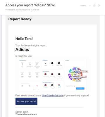
Share your Report
Simply go to the Actions' menu within any page of the report, and select 'Share report'.

This will provide a sharable link that you can directly share via email or copy/paste.

Here is an example of a shared report. It mirrors the report in your dashboard, with the only difference being that activation options are not available. In the Actions button, you'll only be able to view the audience definition.
If you have any questions, feel free to reach out via the platform or email us at help@audiense.com.