Report Dashboard:
The Insights main dashboard will show you a list of the reports generated in a view that provides the following information and options:
- Search Report: Search from your account's entire report list to find a report. Type at least 3 characters into the search functionality and it will populate a refined list of reports
- Create Report: Define the criteria for a new report.
- Report – name of the report
- Segmentation Type - type of report created (Interconnectivity or Affinity)
- Created – date when the report was created
- Access - have you shared this report?
- Status – status of the report: Generating, Finished, Demo, Failed (check out the article on what to do if your report fails here).
- Actions* - here you are able to delete reports, share reports with others in your team by adding their email address, rename the report, download the report (if on a paid plan), see the audience definition, and clone the audience definition.
View your Insight report
Time to get started and view your first report!
First click on the name of the report in blue from the main dashboard to access the Insights dashboard.
The insights dashboard consists of two parts:
- Summary view of the full audience
- Break down of the audience segments
1. Summary view of the full audience:
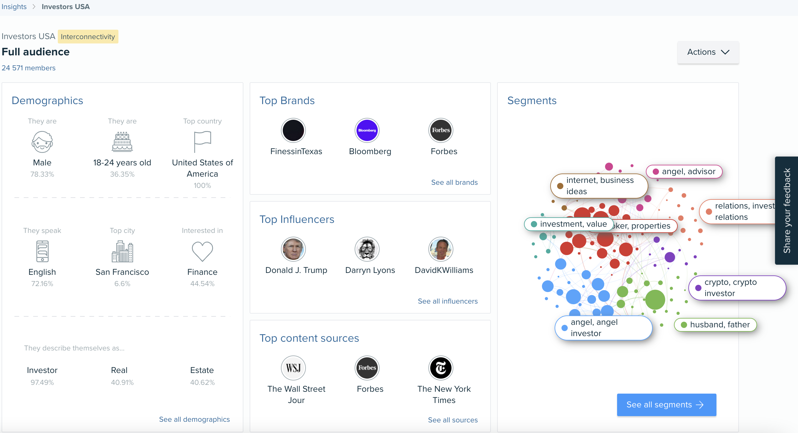
Let’s start with the summary view of the full audience.
This summary simply shows the key insight for your full audience, from:
- Demographic summary
- Brands they love
- Who influences them
- Content they enjoy
- Audience breakdown
On the right hand side you will see the segment distribution graph which is a summary of your audience breakdown by segment. To understand the breakdown of the audience segments, please select "See all segments" on the right hand side under this graph.
2. Break down of audience segments
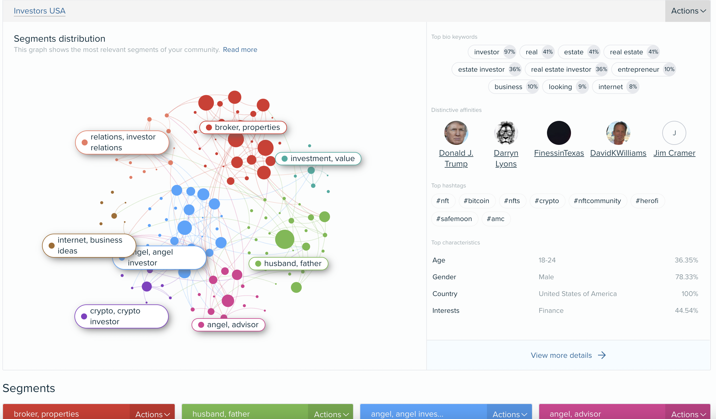
Here you will see the segment distribution graph from the previous dashboard on the left hand side. This quickly shows you segments identified within the analysed community. The size of each segment is proportional to the number of members within it. The lines represent interconnections between the different members of the segments. The bigger the node is, the more connected it is to the rest of members in the audience analysed.
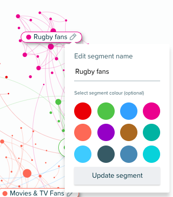
The segments are auto-named based on distinctive bio-keywords used by members within the audience, but you can always re-name them.
Scroll down to see the summary of each of the unique segments identified within the audience. A panel for each of the segments is provided, which highlights the unique characteristics of that segment.
For example:
- How they describe themselves – the main bio keywords
- Affinity – brands and people the users within this audience have the largest affinity for
- Additional characteristics – such as interests, age, location, etc
Click on the Edit icon to rename the segments and/or change the colour:
What shall I name my segments?
When we name our segments we tend to look at the unique characteristics that the report provides. We particularly focus on the following:
- Unique affinities (Influencers & brands tab)
- Bio keywords (Demographics tab)
- Language/location (Demographics tab)
- Content they're engaging with (Content & Media Affinity tabs)
You will learn more about all of this in our next section… Deeper dive.
Would you like to try it yourself? Click here!