![icon-audiense (2).svg]](https://help.audiense.com/hubfs/icon-audiense%20(2).svg)
This post is to help you identify the different elements of the Audiense interface that are mentioned in this user guide and give a very brief description of their basic function.
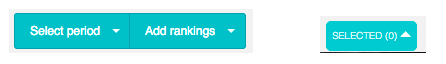
- Top menu bar – This is always visible and is the main navigation area for accessing the different functions within Audiense.
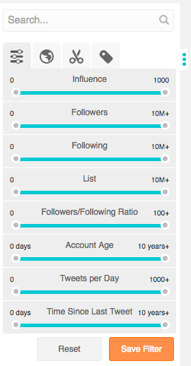
- Search/filter sidebar – This is always active when the community wall is on screen. It is used to search and filter the users on the wall.
- Community bottom bar – This is always active when the community wall is on screen. It is used to order users and to access community management actions to apply to those users on the community wall.

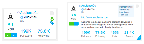
- User cards – They form the community wall. One user card per member of a community. A user card shows the basic information of that user and there are two types: standard and detailed.
- Sidebars – These show information which varies depending on where you access them from in Audiense.
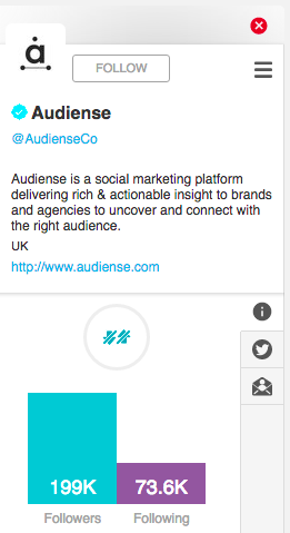
- – User details sidebar – Click the username or avatar on the user card to see more info about this user. There are three tabs: info tab, Tweets tab and email contacts tab which shows enriched profile information and which is only available for users you have added as a source using Convert Emails into Profiles .
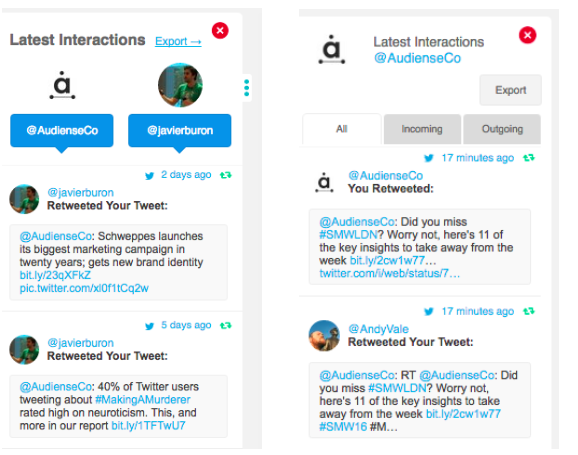
- – Latest interactions sidebar – accessed from the blue @ symbol in the bottom right corner of the user card (the interactions between you and that user) or from the engagement drop-down menu (the interactions of the account you are logged in with).
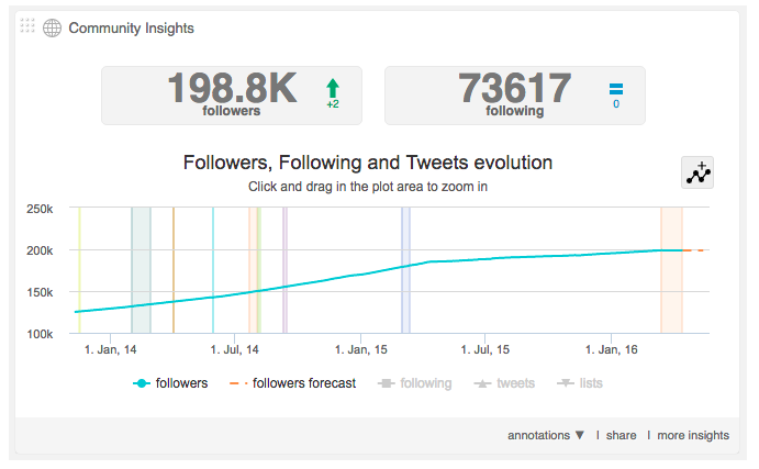
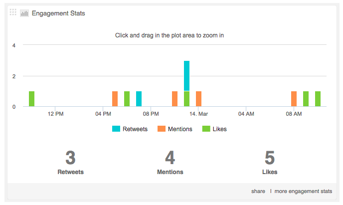
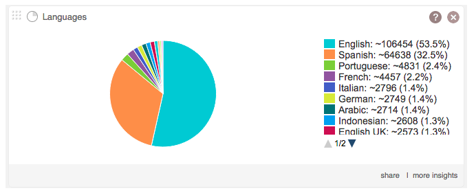
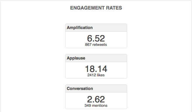
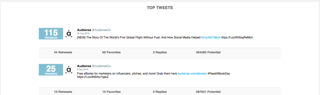
- Panels / Widgets – These are sections of the screen which show specific information relevant to a dashboard, Monitoring, report, analytics, etc. Panels are principally informative and widgets offer more user interaction and if you click on them they expand to give more detailed information. Panels and widgets can take the form of:
- – line graphs
- – bar charts (horizontal or vertical)
- – pie charts
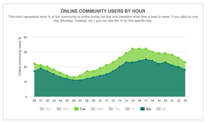
- – area graphs
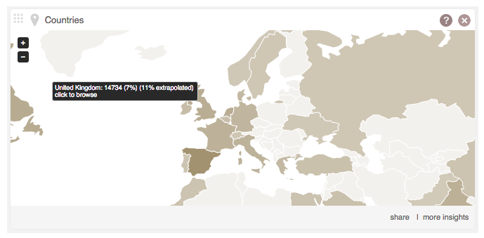
- – maps
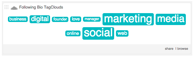
- – tag clouds
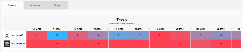
- – tables
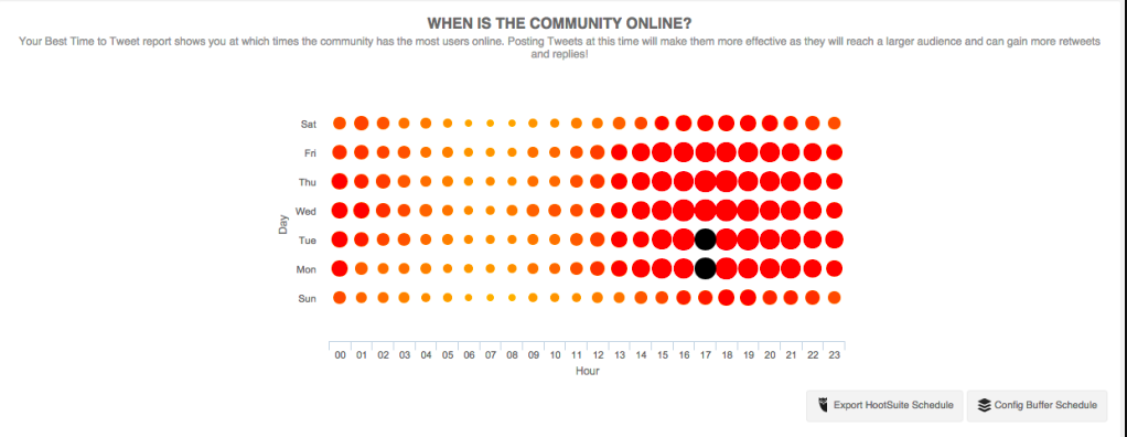
- – heat maps
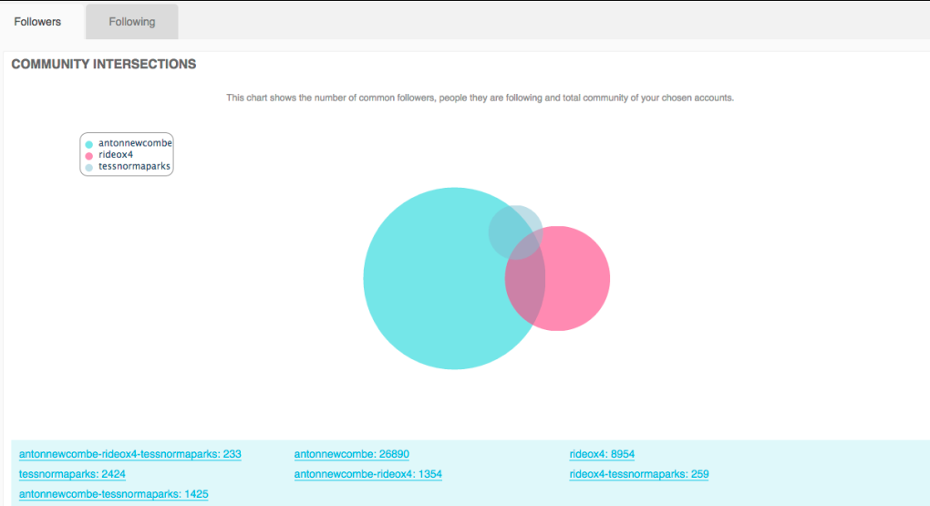
- – Venn (set) diagrams
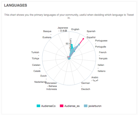
- – radar (spider) charts
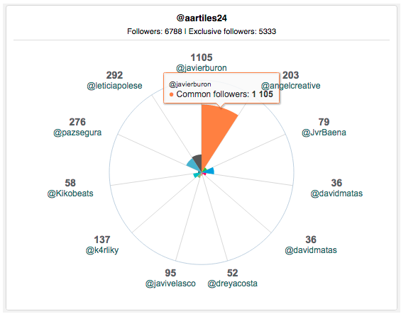
- – Polar area charts
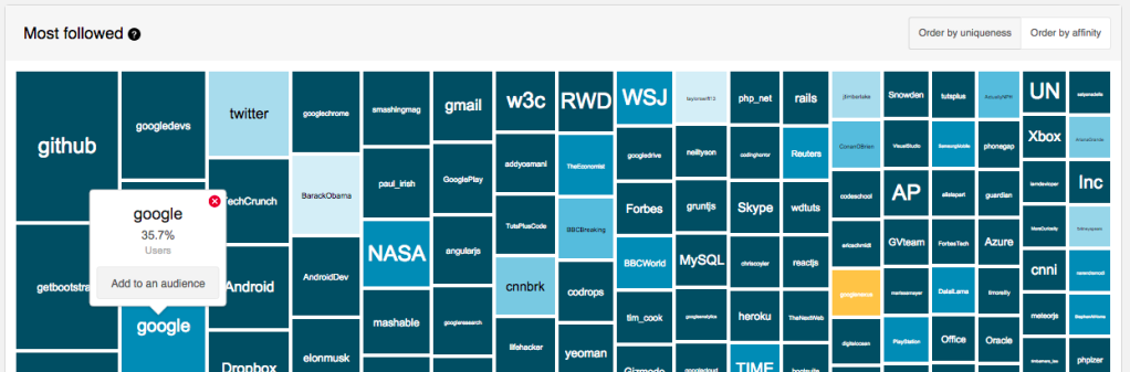
- – tree maps
- – info panels
- – listings
- Tabs – These are similar to traditional index cards but in digital format. Each tab opens a separate page of information. They can be in horizontal or vertical format.

- Drop-down/drop-up menus – These usually have a title and a small arrowhead to the right. If you click on the arrowhead the options associated with that menu are displayed.
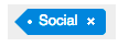
- Tags – These are useful labels you can apply to users.
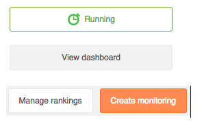
- Buttons – These are clickable and perform a specific function clearly defined on the button itself.
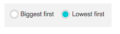
- Radio buttons – These are small selectable circles which allow you to choose only one of a predefined set of two or more options.
- Icons – These are small images which when clicked perform a function. They usually show an emerging descriptive text of the function if you mouseover them.

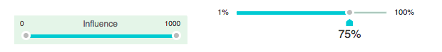
- Sliders – These are controls with one or two handles that move horizontally along a bar to select a range.